AR Avatar Customization Using Adobe Aero
This document is a review of how a digital avatar project was created and deployed using Adobe Aero.
-
Documentation for the project itself can be found here.
-
The Aero customization can be accessed by scanning this QR Code or following the link here
-
The web site customization site is here
-
The shared assets used for the web and AR integrations can be found here
1. Creating Design Elements in Figma
1.1 Porting Web Assets
Various design elements for avatar editing were from a web site for Avatar customization. The elements were in SVG format using filled black paths layered on top of white square backgrounds. Styling from CSS and Bootstrap code was lost for various elements. Important items that that needed to be recreated include:
- Alignment between UI elements and with the viewer.
- Grouping, placement, and sizing of UI elements including to support various mobile and tablet devices(*)
- CSS templates for element styling such as background, selection / border color, rounding of icons etc.
New design elements were created to replace menu buttons (“Edit Avatar” button) and support 3D viewer navigation (“Align 3d Scene with Camera” button). They initially were black and white square SVGs to match the existing UI elements.
In place of built-in selection highlighting support in HTML, selection boxes were created and exported as SVG images.
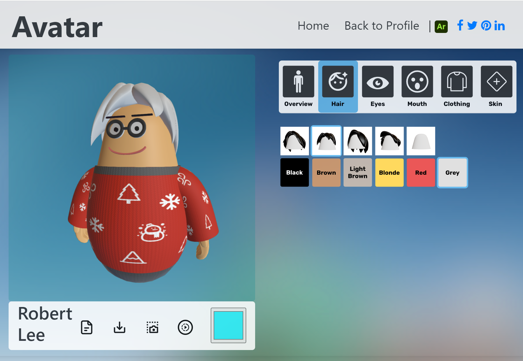
1.2 Import and Placement
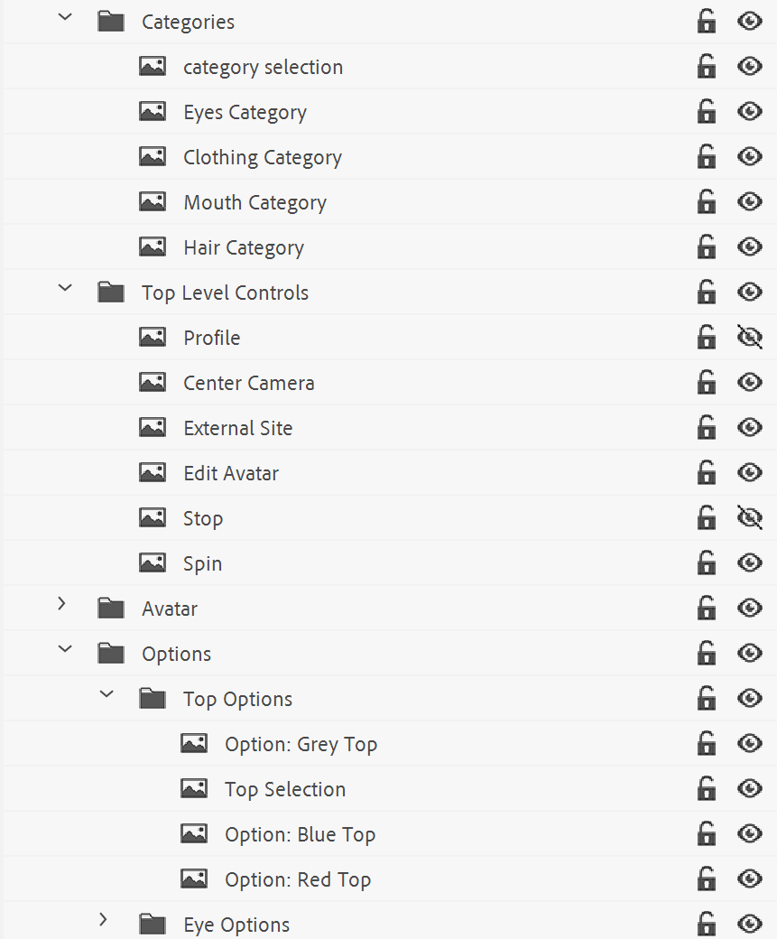
Each of these SVGs was imported as an “asset” into Aero and placed relative to a 3D avatar model. The reason for this is that the origin of the avatar was set as the “anchor point” when viewing in AR.
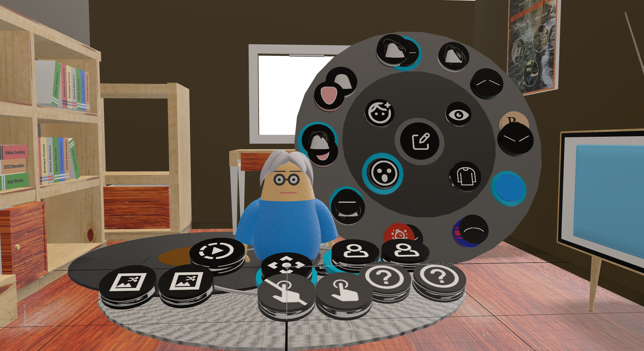
An attempt was made to group the SVGs in a logical hierarchy consisting of a “top level” menu, “category” menus, and category “option” sub-menus.
Each SVG had to be imported individually to allow visibility toggling. This toggling is equivalent to hiding and showing individual or groups of DOM elements in HTML. For example, the clothing (“Top Options”) group could be hidden or shown depending on whether another category was selected.
Due to the lack of any alignment and sizing tools the process of setting up the UI to look like the Web version was time consuming.
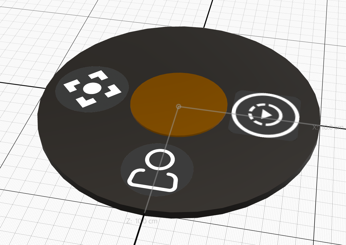
For the first prototype, to simplify the layout, all options per customization category were placed in single horizontal rows.
Initial designs located the options around the 3D character, so that they were visible on a phone or tablet. Subsequent prototypes refined the placement of UI to be more evenly spaced based on user feedback. UI was redesigned from square icons to 3D cylinders for ease of selection.
1.3 Adding UI Triggers and Actions
UI interactions were implemented by adding triggers and actions to UI geometry in the scene. The most common trigger type used was the “Tap” trigger which invokes actions when specific geometry is pressed. The common action types used were: hide and show geometry and move geometry to a location.
For example, when the “Clothing” category button is tapped, the hair, eye, mouth, and top options geometry are hidden. The selection ring geometry is moved to where the clothing category geometry is made visible.
The same logic is used for all other category geometry with different sets of geometry hidden / shown. The “Eyes” category trigger is shown below for comparison.
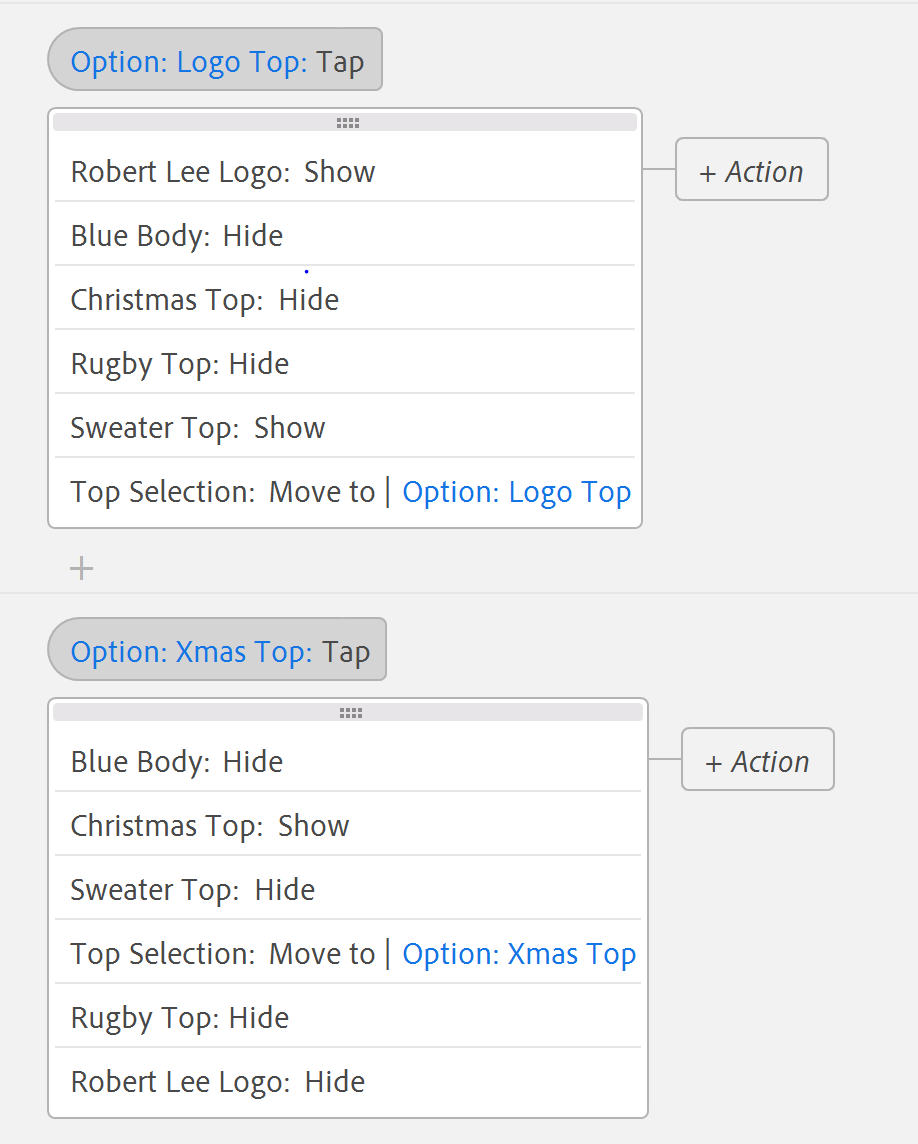
Another example is the “options triggers”. Instead of hiding or showing UI, parts of the 3D avatar are hidden / shown.
For example, when the “Logo Top” geometry is tapped / pressed, all other top variations are hidden. Again, to indicate the current UI choice, a selection ring geometry is moved to the location of the currently pressed option’s geometry.
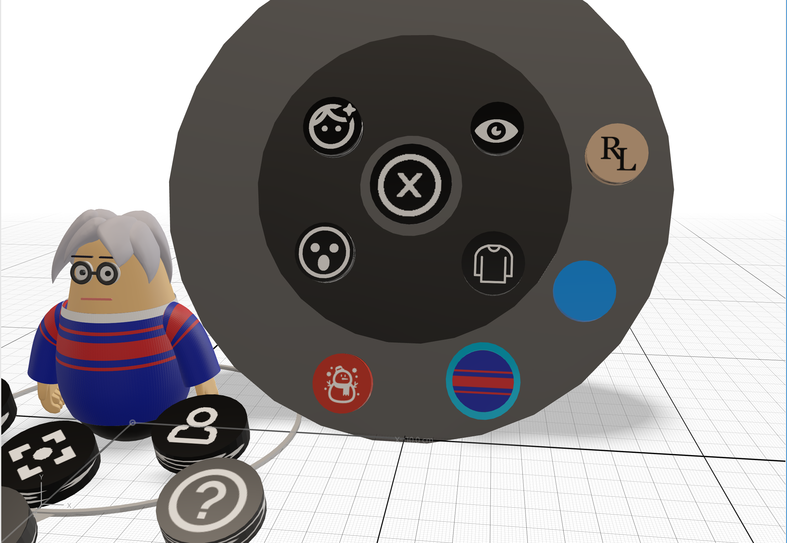
2.0 3D UI, Avatar, and Dioramas
2.1 3D UI
It was found that there are various issues with using a 2D SVG based UI. This includes:
-
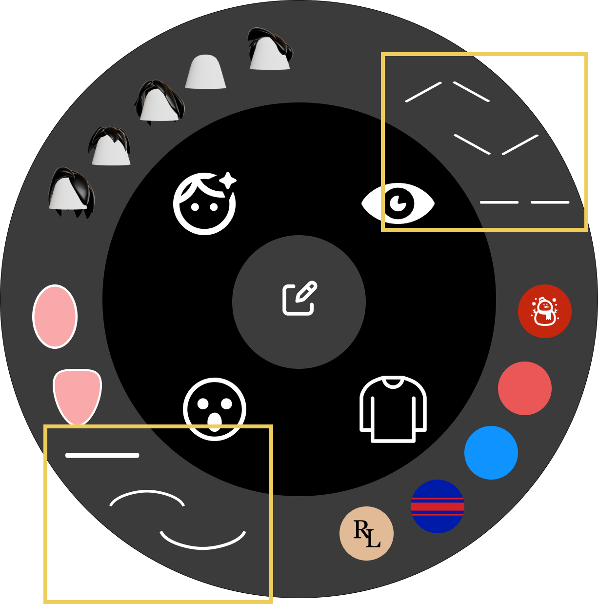
Any area not within the vector paths or any area that is semi-transparent is completely transparent and not selectable in Aero. Several icons have paths which take up a small amount of surface area were difficult for users to select. For instance, the “eyebrow” and “mouth” icons shown below were hard to select.
Unfortunately, it is not possible to define a selection area within Aero.
-
The SVGs icons overlaid on top of each other could be un-selectable as Aero could not distinguish which items were on top of others. This was worse on mobile due to geometry compression as the elements occupied the same location relative to the viewer.
- The more acute the viewing angles on icons the harder it became to select as each icon has effectively zero thickness.
- The UI used to indicate currently selected items could sometimes become obscured or not visible.
It would be useful to have some control for this.
For example, in Unity it is possible to set a selection box for selection testing, and in Figma it is possible to set a transparent selection box that represents the interactable area. For Web there is the ability to set depth priority for HTML DOM elements via a “z-index” attribute:
<img src="my.svg" z-index: 3;"/>
To address these issues 2D UI was replaced by 3D geometry. This allowed for:
- 3D geometry (buttons) are selectable instead of the vector paths
- Adding depth to icons, selection rings and icon backgrounds.
- Depth separation between 3D elements.
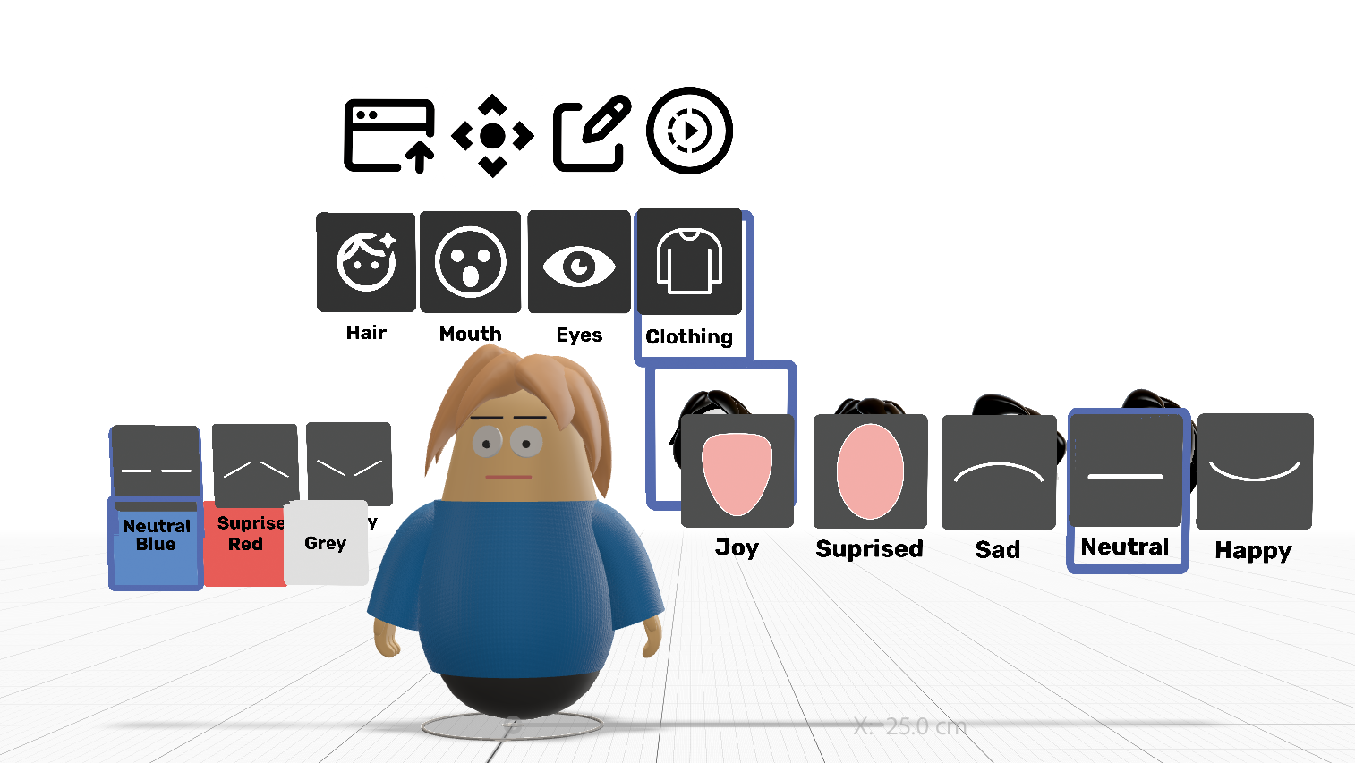
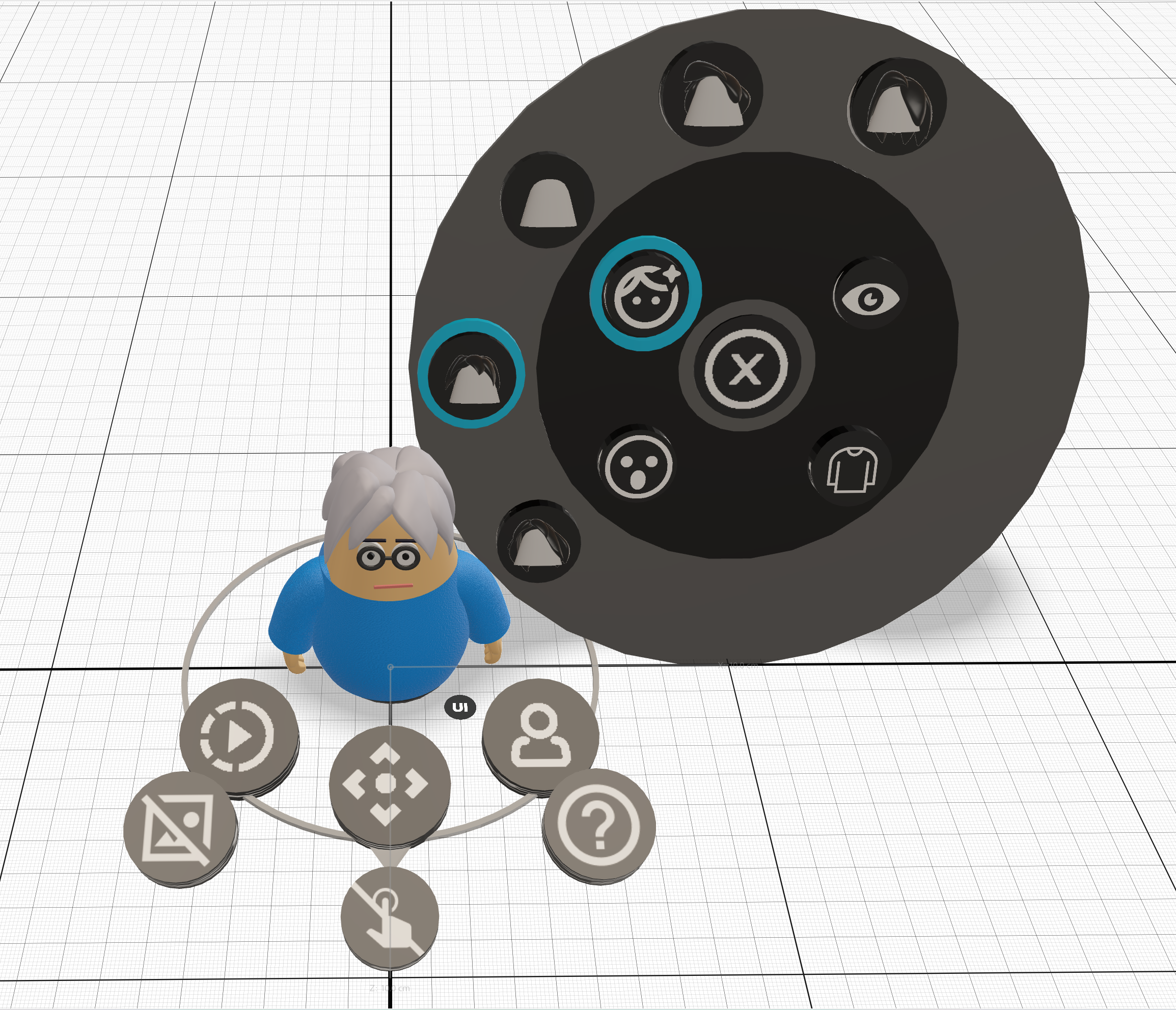
Below is a snapshot of some of the UI created. A basic cylinder was used for each button. The labels were exported as PNG images from Figma and mapped on to separate buttons. The entire cylinder becomes the selectable area instead of just the icon paths. The background radial menus and the selection UI (ring) was modeled as a series of circular geometry.
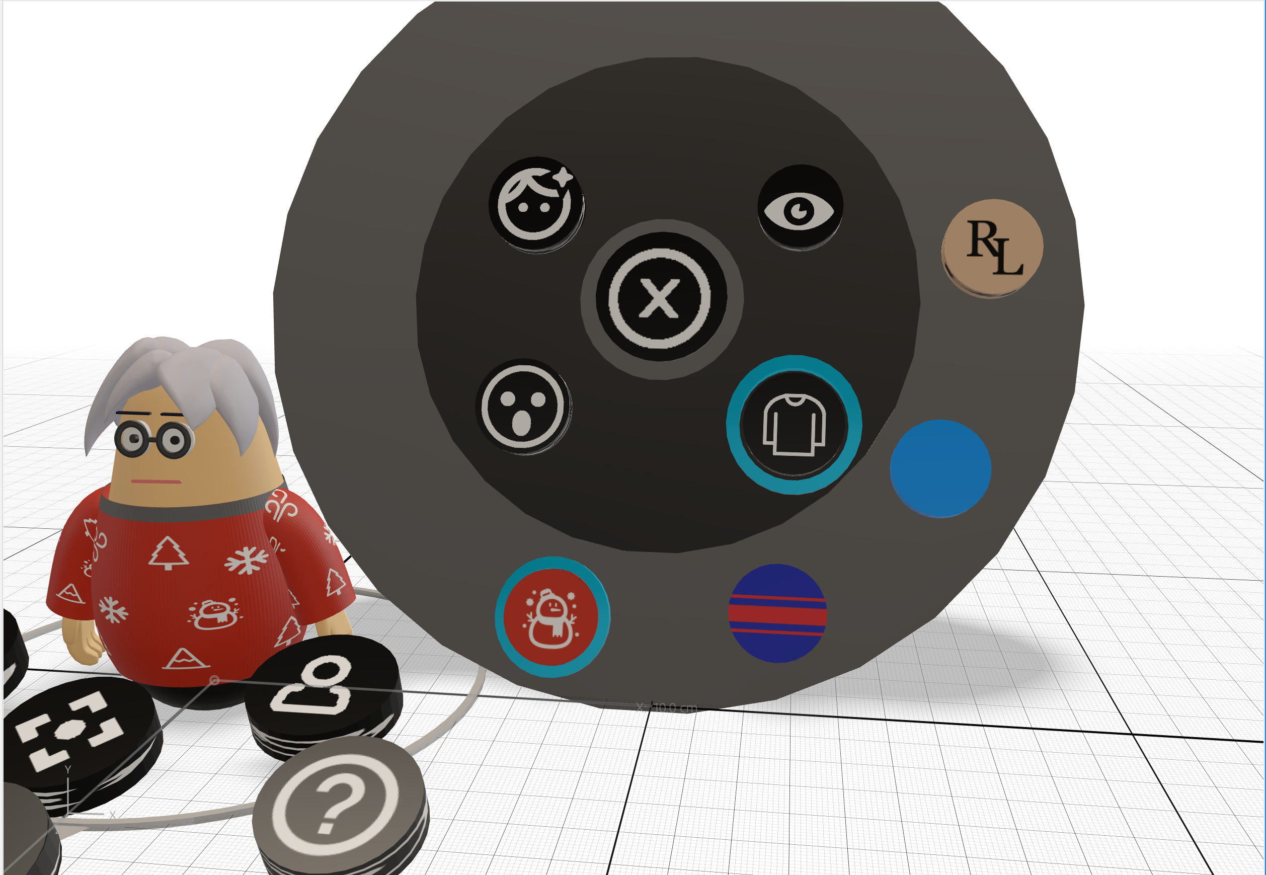
Below is a snapshot of the 3D UI imported into Aero. Note that every UI state variation is a separate piece of 3D geometry.
2.2 3D Avatar
The avatar geometry was created for the Web customization project found here. The entire scene hierarchy was exported as a single glTF file.
Aero does not currently support importing scene hierarchies. Once imported, the appearance (materials) of model parts cannot be modified nor customized via actions.
To work around this, each customizable part of the avatar was exported as individual files and imported into Aero. As Aero does not preserve the transformation of imported geometry each part had to be resized and re-positioned. The avatar in Aero is an estimation of the original model dimensions and placement.
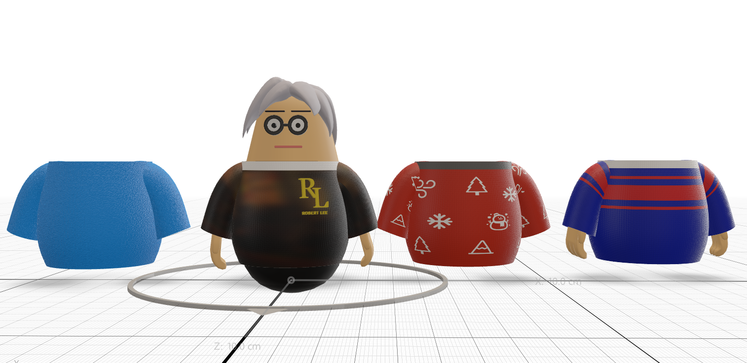
A separate model was required for each material variation. To reduce file size fewer options were ported. For example, only a few of the color or texture options for the shirt, eyes and hair are supported in Aero.
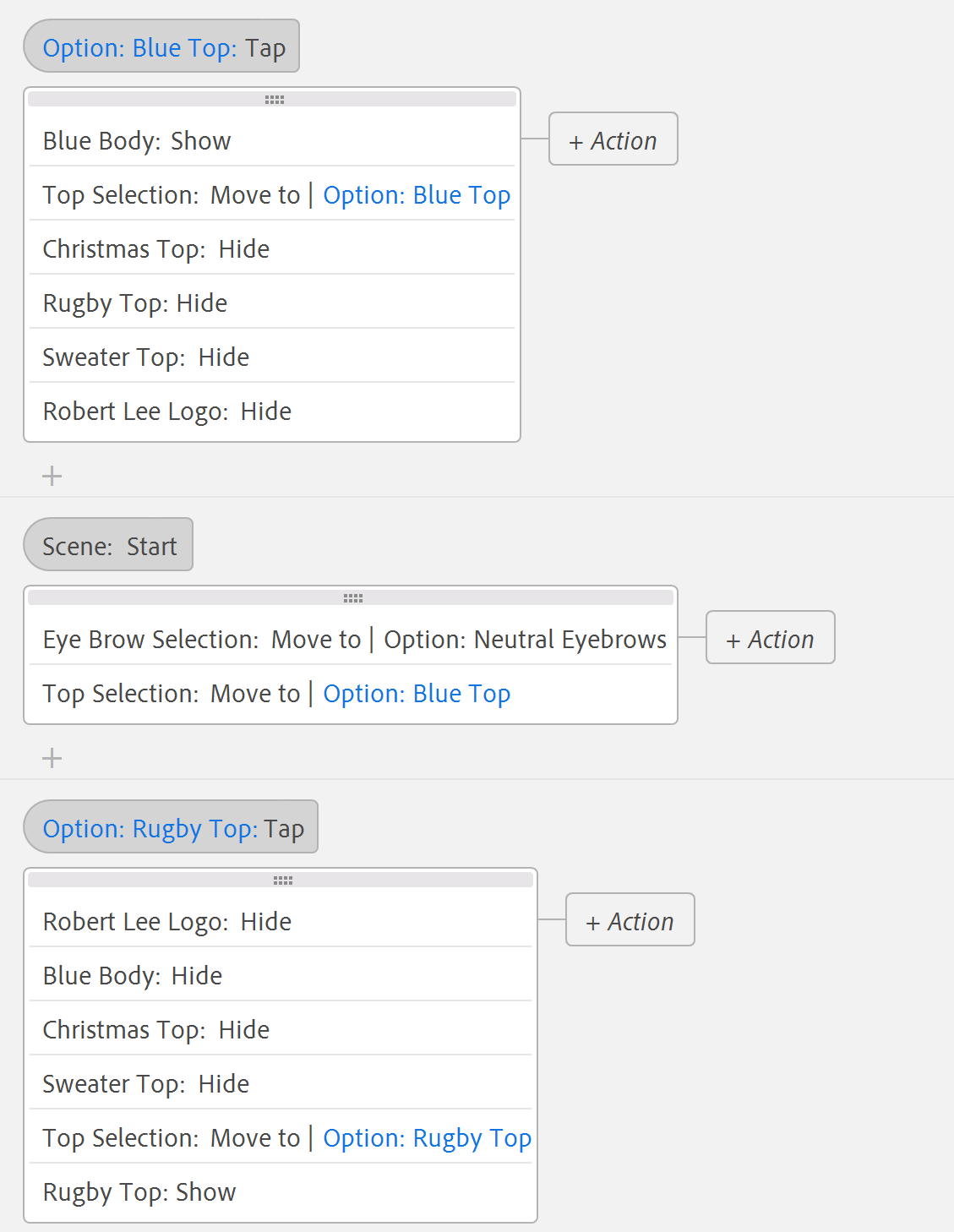
The triggers for UI options which control appearance were created to perform the action of hiding all the options’ associated Avatar geometry and showing the currently selected one.
|
|
|
In the example above, each shirt option’s geometry has a trigger added which:
- Hides all the other shirt geometry
- Shows the selected shirt geometry
- Moves the selection UI (ring) to the position of the selected option’s UI.
An additional “start” trigger places the selection UI (ring) to the default option’s position.
|
|
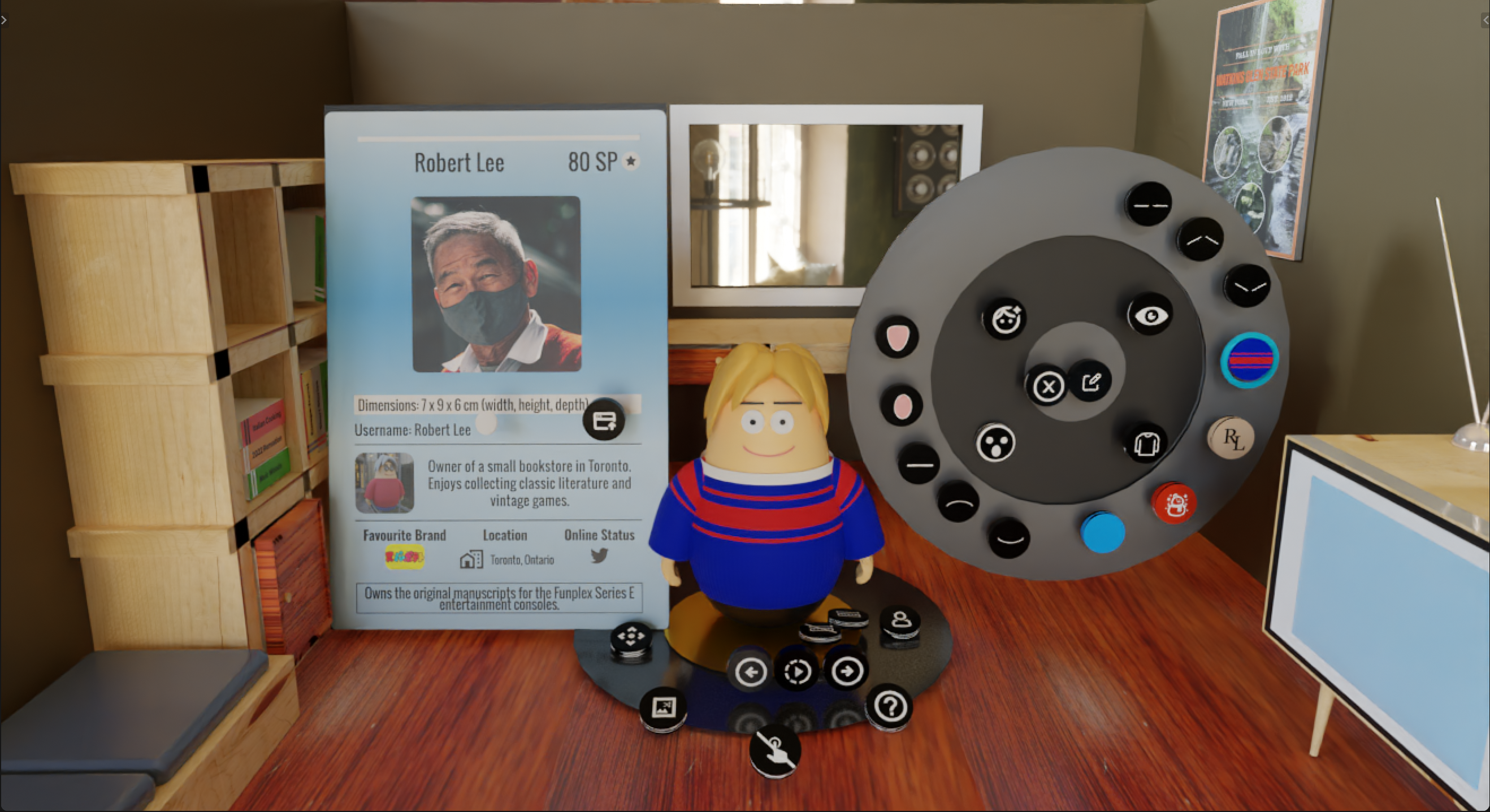
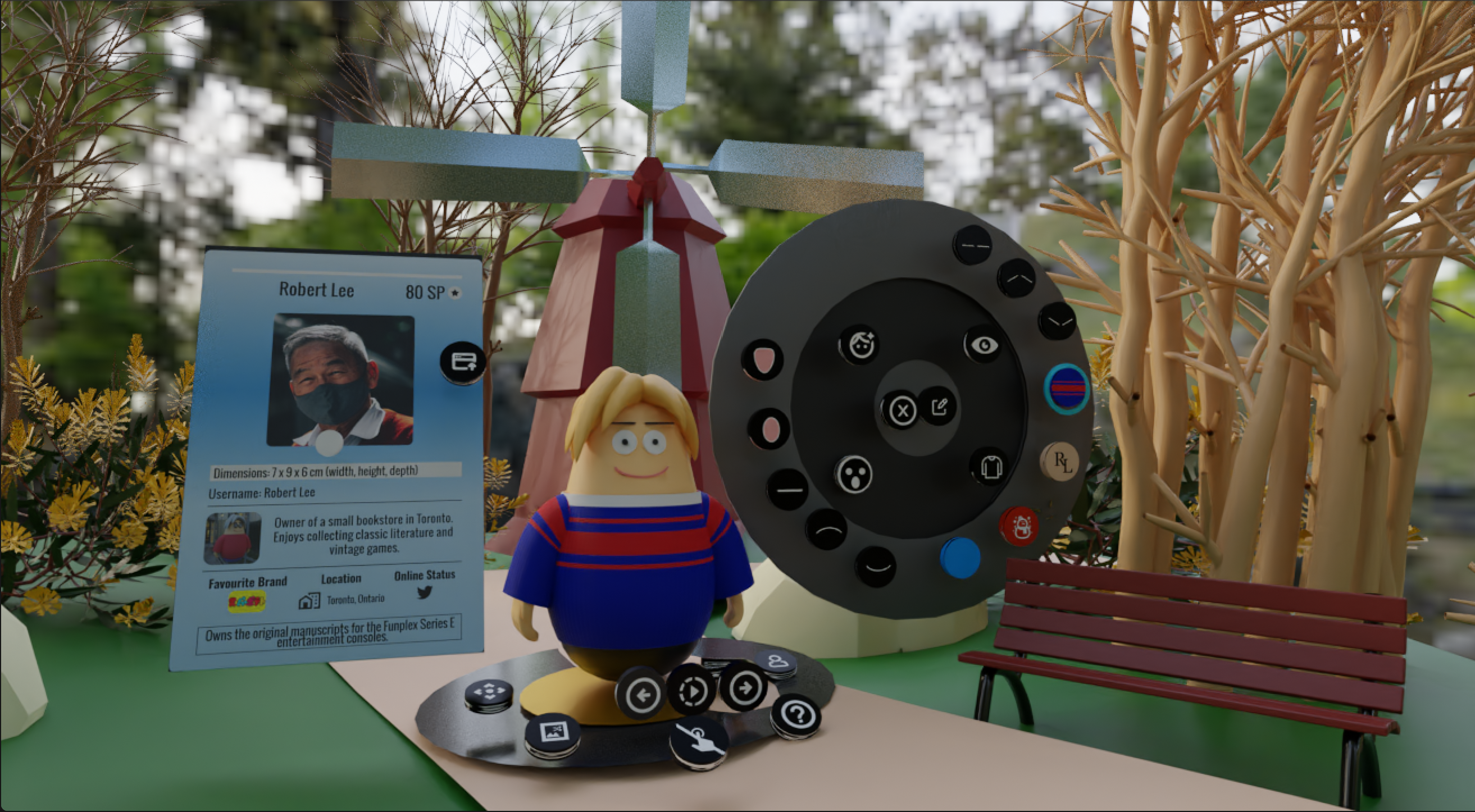
2.3 3D Diorama
Dioramas were created to provide a virtual setting for the avatar, with an indoor office room and park environment created. Model parts were created in Blender and sized relative to the avatar and UI.
Model and texture size was reduced to be more efficient to load in Aero. Texture size has the greatest overhead for file size in Aero.
Sections of the ground are flattened to allow placing the avatar at an even viewing angle. Diorama assets were placed around the avatar UI so users would not encounter selection or visibility issues with the interface.
Shown above are mockups of the UI placed within each diorama for testing placement and interactable space for users.
3. Aero Interaction Sample File
An example Aero file which gives examples of the various UI interactions can found here
A video of the interaction is included below:
Download the MP4 video.